Website Redesign
Nova Echo AI Website Redesign
Independent redesign based on the publicly available Nova Echo website. This project is not affiliated with or endorsed by Nova Echo.
Web Designer, Frontend Development|Personal Project|Jul 2026
Tools Used
GSAPNext.jsTailwind CSSVercel
Nova Echo is an AI voice platform helping businesses automate inbound and outbound phone conversations.
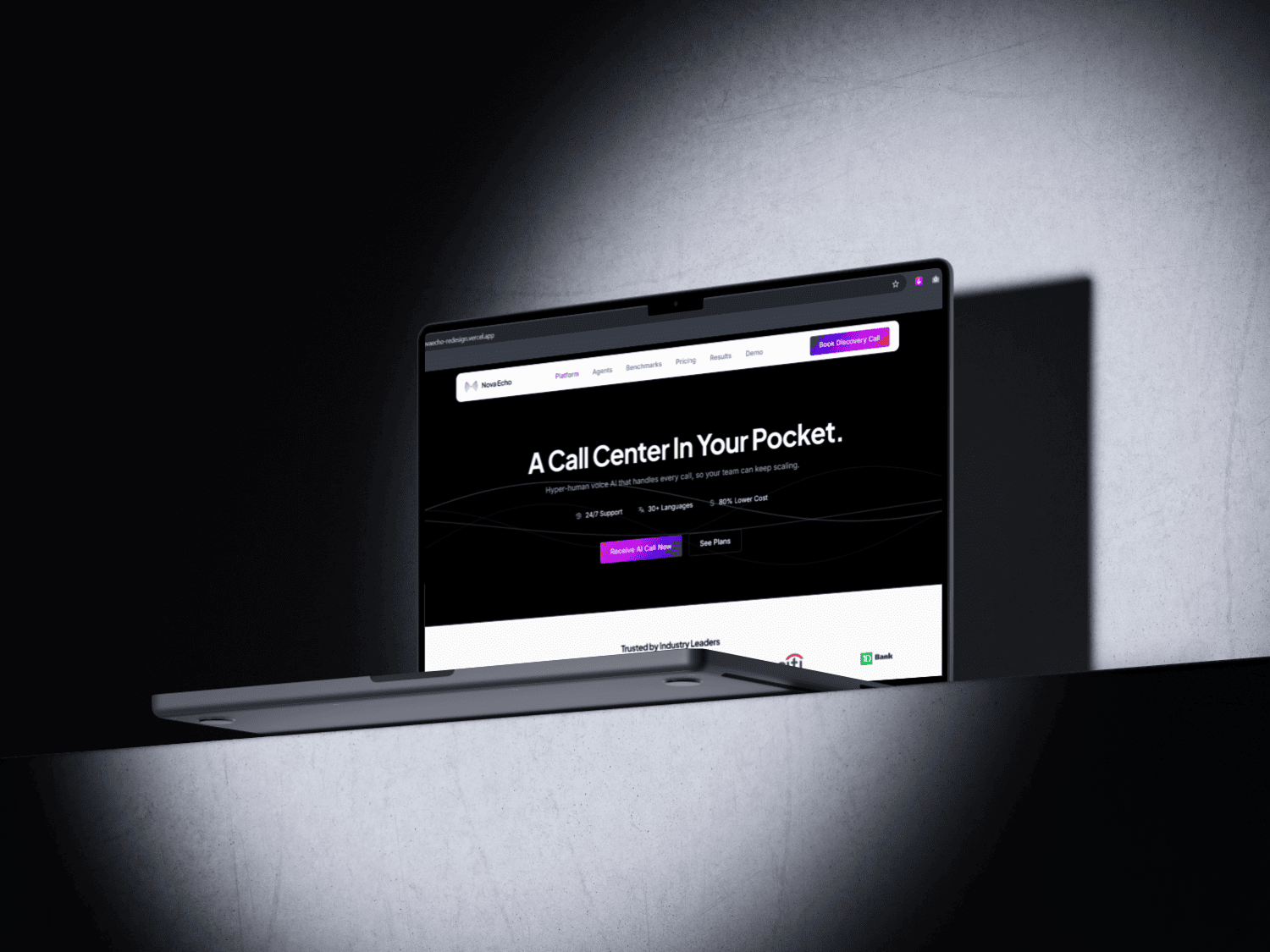
While the product is compelling, I saw opportunities to improve the website's visual consistency, information hierarchy, and conversion flow. This redesign reimagines the homepage using the same product messaging, with a stronger focus on usability, clarity, and a premium user experience.
Audits on the Official Website
Before redesigning, I reviewed the official website and identified a few recurring issues:
Inconsistent use of brand colors across sections
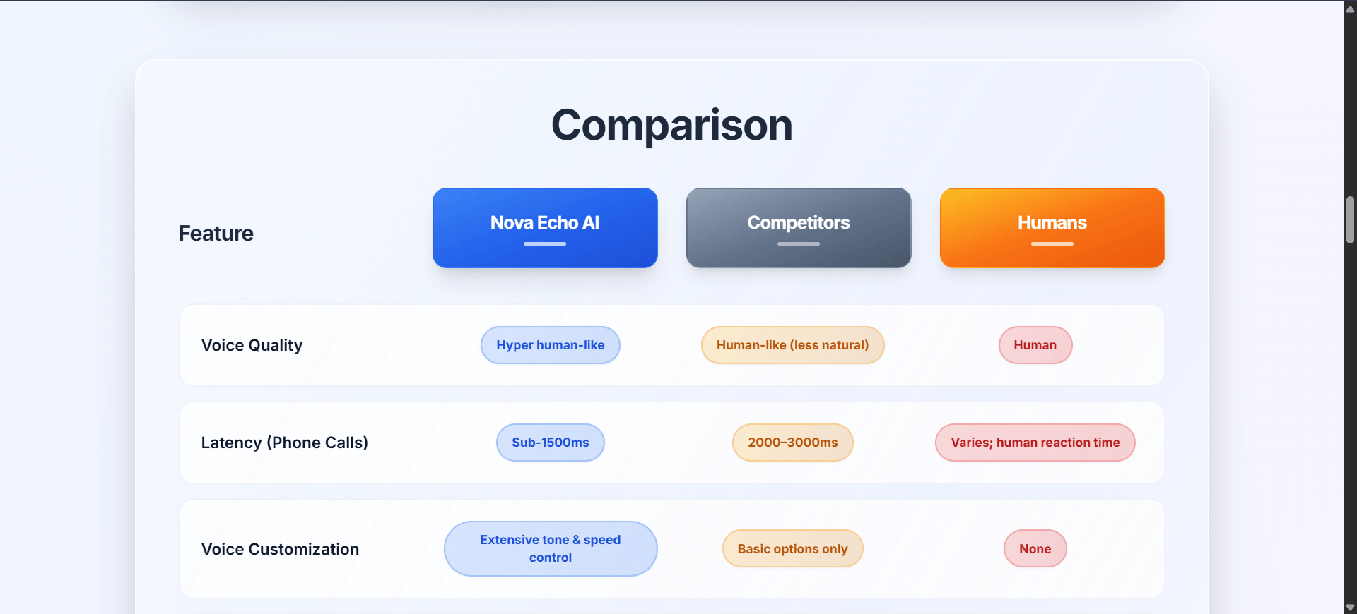
CTA gradients that felt visually inconsistent
Navigation that disappeared while scrolling
Dense card layouts that competed for attention
ROI Calculator hidden behind unnecessary navigation
Broken footer links such as Support
These findings shaped every design decision that followed.
Design System
Rather than introducing a new visual identity, I refined Nova Echo's existing branding into a consistent design system.
The redesign keeps the original brand colors while introducing a structured surface scale for better hierarchy across the interface. Every design decision—from colors to spacing and components—was documented in design.md to ensure consistency throughout the project.
Code Snippet
###Brand Colors
--black:        #000000
--white:        #FFFFFF
--navy:         #1E3A8A
--cyan:         #00D1FF
--sky:          #4FACFE
--magenta:      #E61EAD
--purple:       #7000FF

###Derived surface scale
--surface-950:  #000000   (page background — brand black, hero only)
--surface-900:  #0B0B0F   (derived, navy-tinted near-black — large surfaces, avoids stark OLED-black)
--surface-800:  #101A33   (derived — card / panel background)
--surface-700:  #1E3A8A   (brand navy — elevated surfaces, default button fill)
--surface-50:   #FAFAFA   (light section background — features, stats, etc.)
--surface-100:  #F5F5F5   (light card / panel background)
--surface-200:  #E5E5E5   (light card border)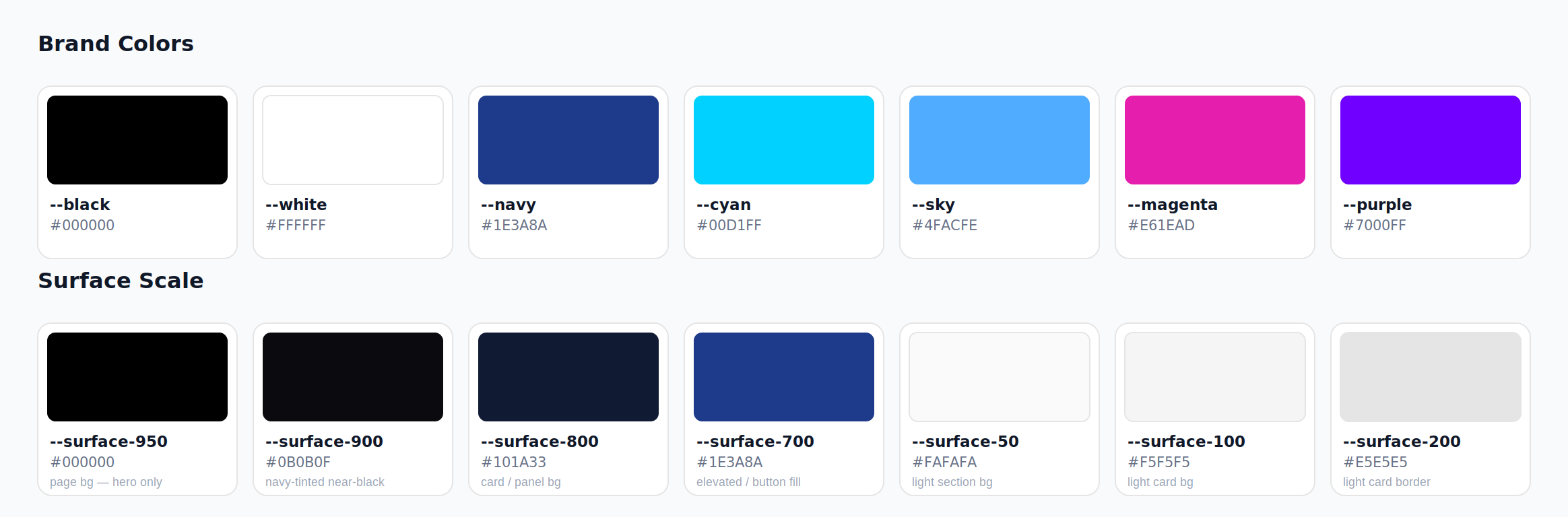
AI-Assisted Design
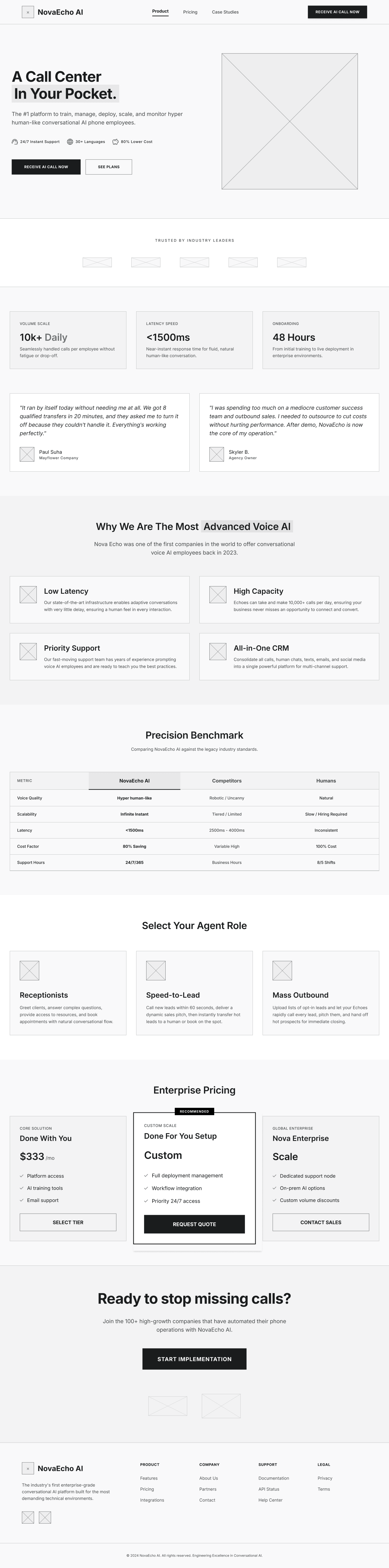
To speed up early exploration, I used Google Stitch to generate an initial wireframe.
Rather than treating it as a final design, I used it as a starting point for layout exploration. The interface continued to evolve through multiple design and development iterations until it reached the final result.
AI-Assisted Development
The website was built using an agentic development workflow.
Instead of manually writing every line of code, I focused on product decisions, UX quality, and design direction while AI handled implementation. To keep every development session consistent, I created an agents.md document that defined coding standards, project architecture, and implementation rules.
Code Snippet
## Code conventions

- TypeScript strict mode, no `any` unless justified in a one-line note
- Full file rewrites when editing a component — never leave a partial diff half-applied
- One component per file, colocated by section: `/components/hero`, `/components/nav`, `/components/pricing-card`, etc.
- Motion logic (GSAP timelines, ScrollTrigger setup) lives in a dedicated hook per component, not inlined in JSX
Improvements
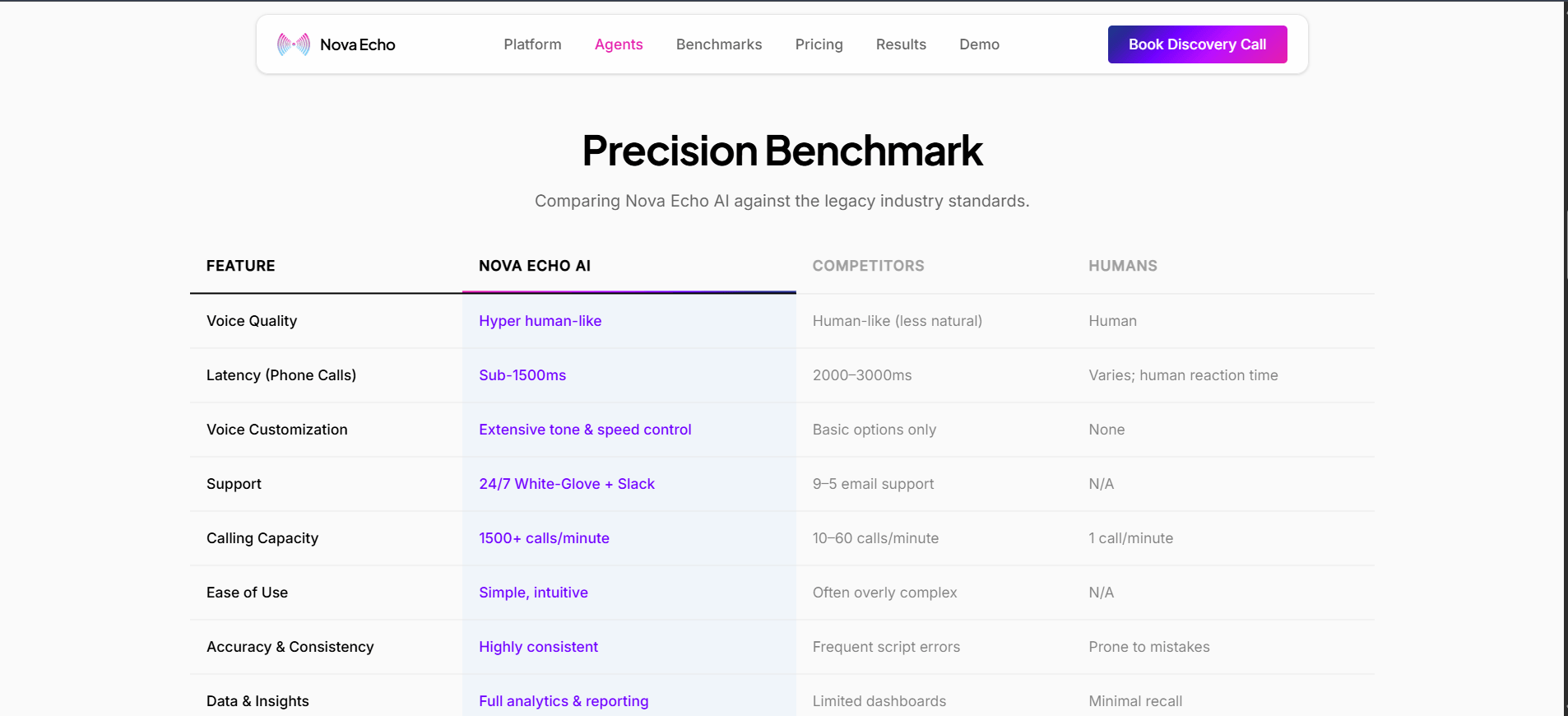
The final redesign delivers a cleaner and more polished experience while staying faithful to Nova Echo's original messaging.
Highlights
Unified design system
Sticky navigation
Consistent CTA styling
Reduced visual clutter
Direct ROI Calculator access from every AI Agent card
Smoother motion and micro-interactions